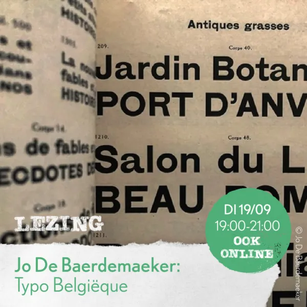
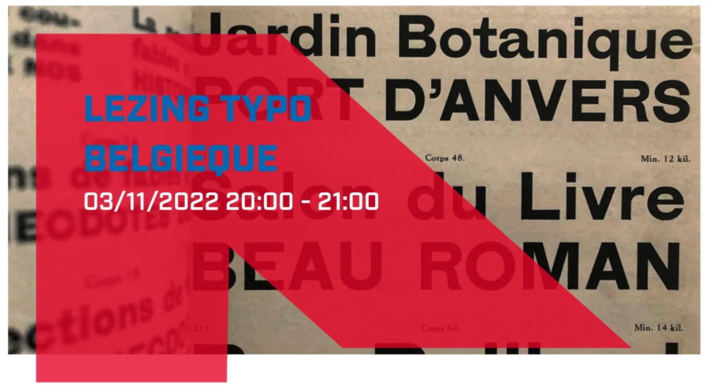
Belgian typographic design has often been overlooked by styles from surrounding countries. Can we define one specific “Belgian style”, or should we follow claims that it is fragmented, and merely influenced by characteristics of other international typographic styles?
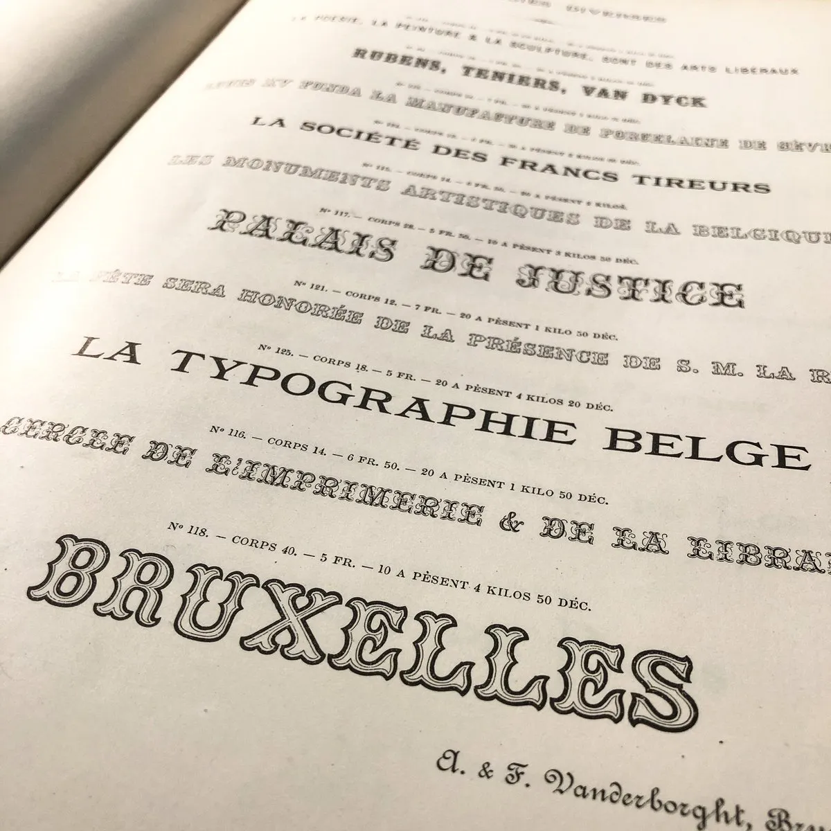
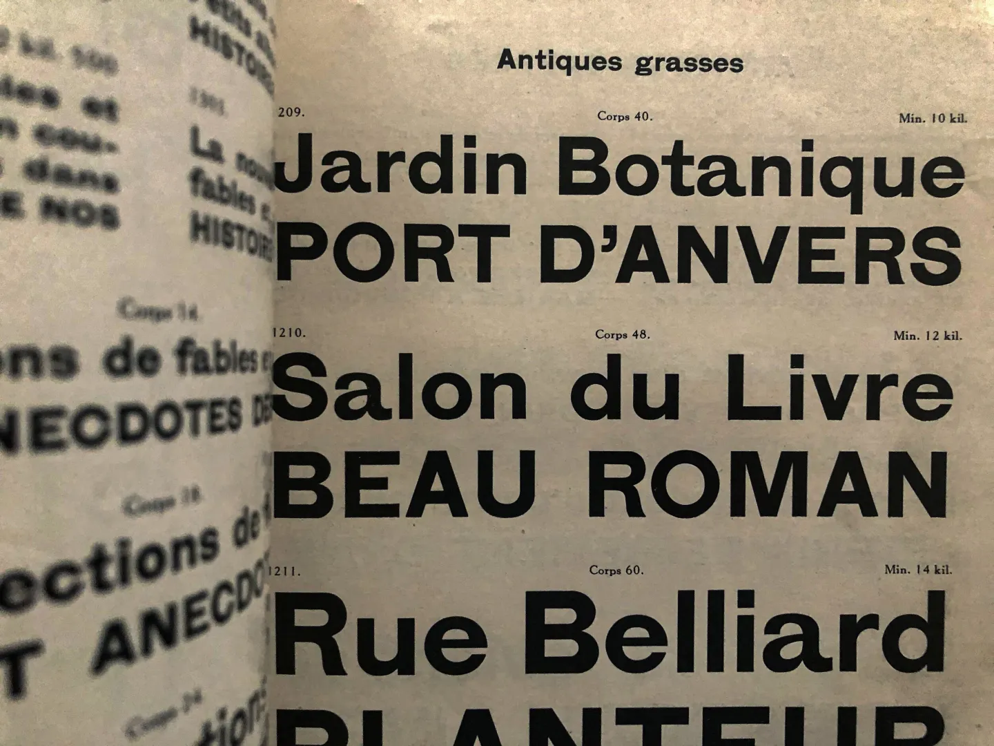
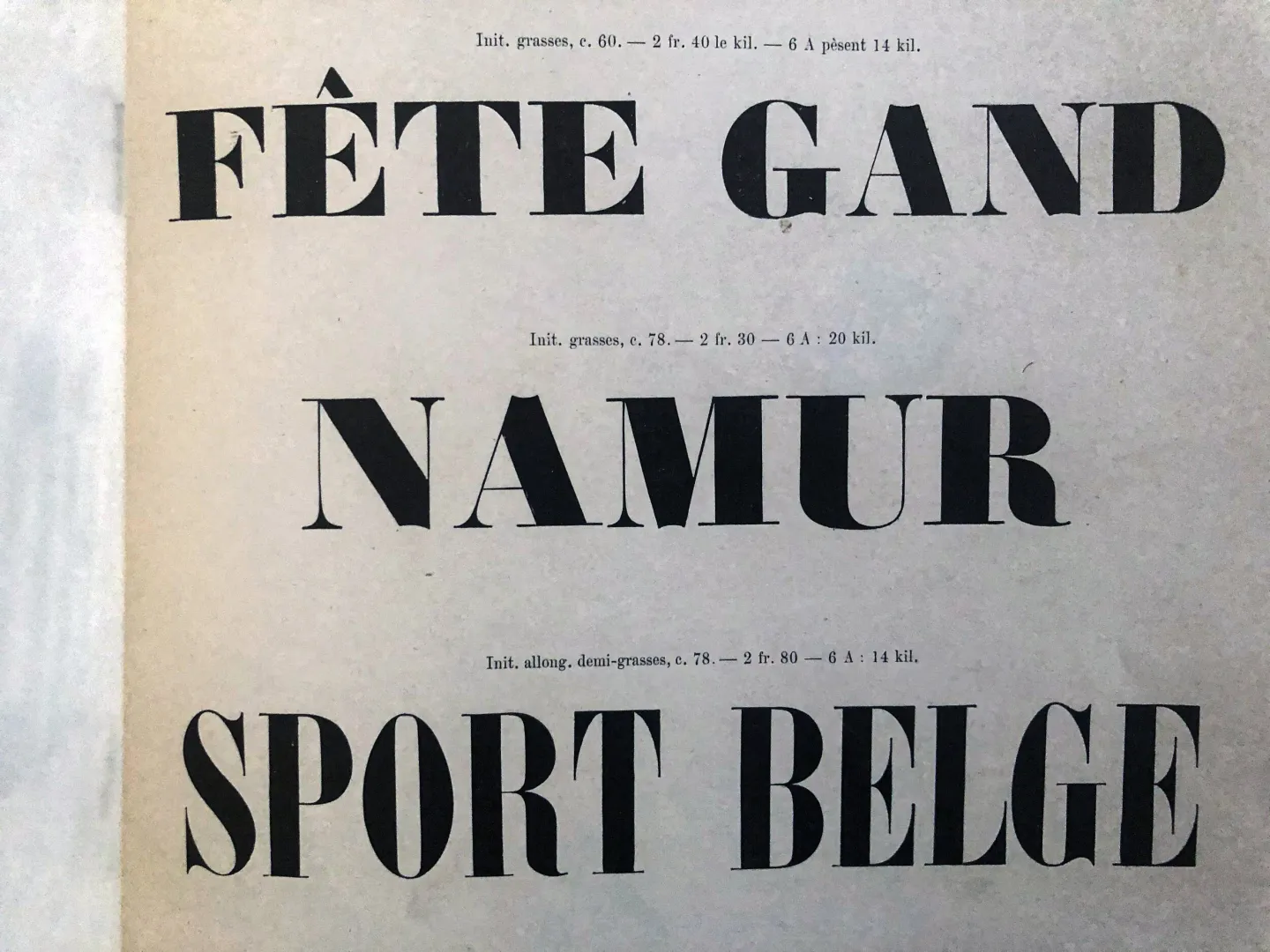
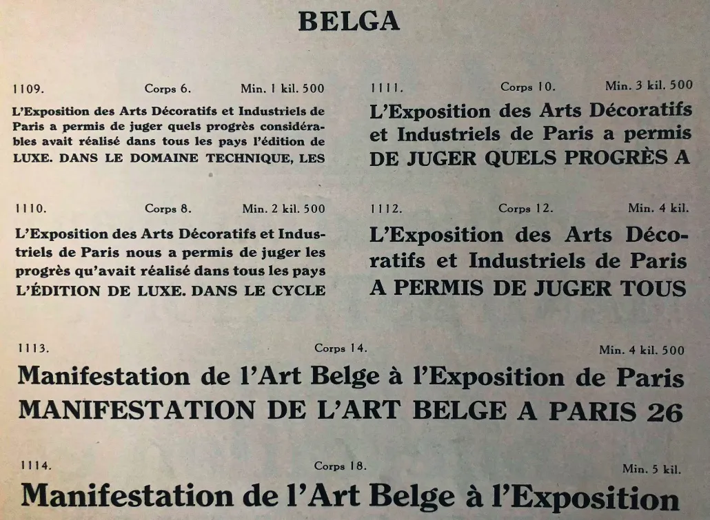
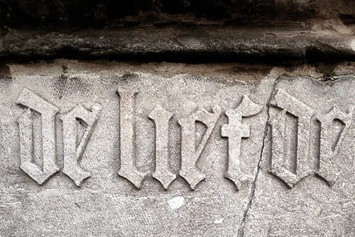
This practice-based research & type design project will shed a light on authentic, traditional, typeface designs and typographic practices which emerged from Belgian regions, and draws on De Baerdemaeker’s ongoing research on tracing the origins and evolution of typography in Belgium.
Flanders DC posted an article with me where I talk about the Typo Belgiëque project, which you can read here:
https://www.flandersdc.be/en/magazine/jo-de-baerdemaeker-typo-belgieque
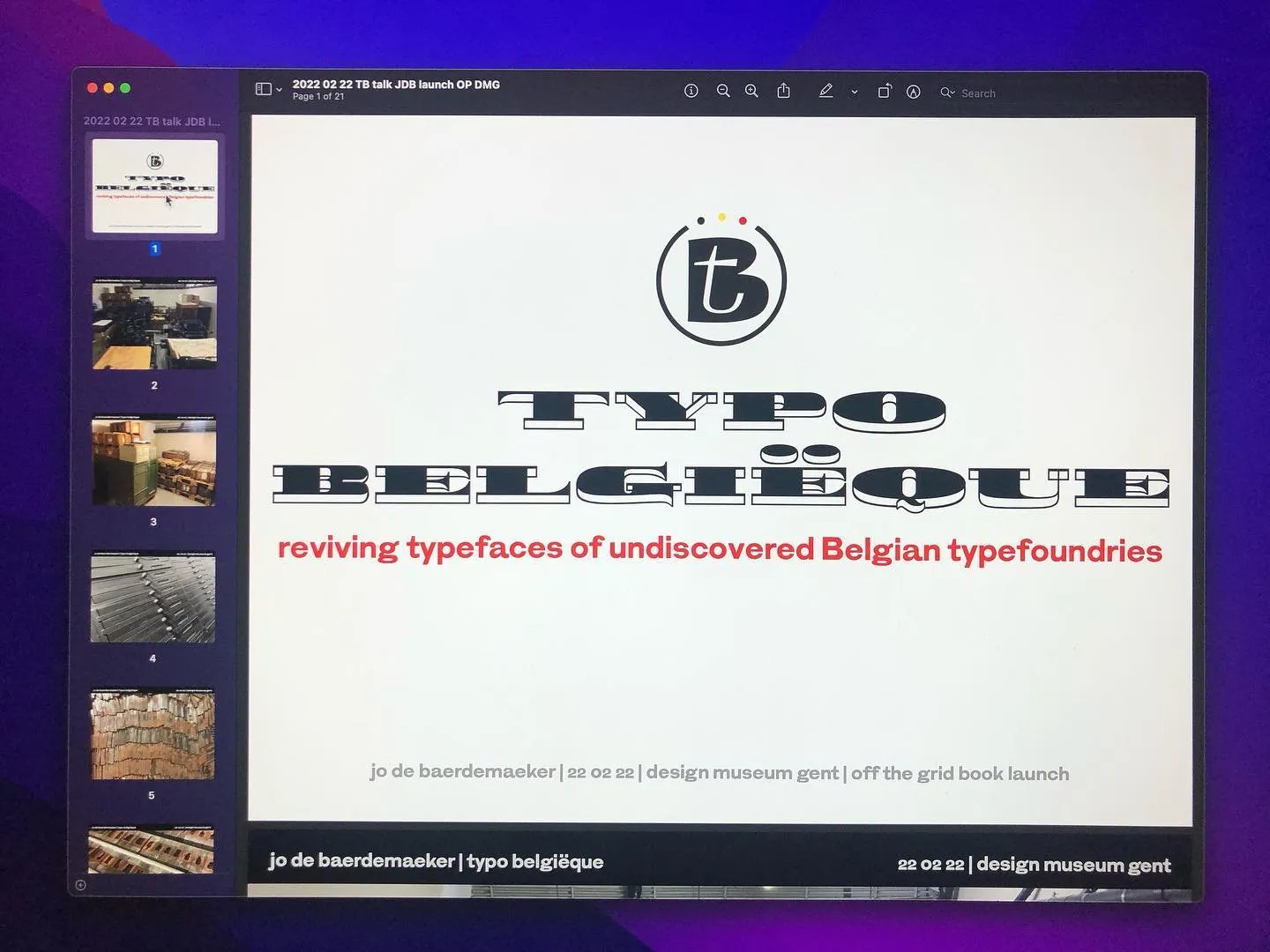
An introduction to this project was presented during ‘This Is’ (a series of public events which accompany the exhibition ‘Off the Grid’) at Design Museum Gent on 13/02/2020.
The concept behind this project is explained in the article ‘Times New Belgian: de nieuwste leestechnologie met eeuwenoude Belgische letters’ [Times New Belgian: The latest reading technology with centuries-old Belgian letters] in national newspaper de Tijd on February 6, 2021, which you can read here [Dutch only (for now)]:
– – –
Stay tuned for regular updates and events on Typo Belgiëque…
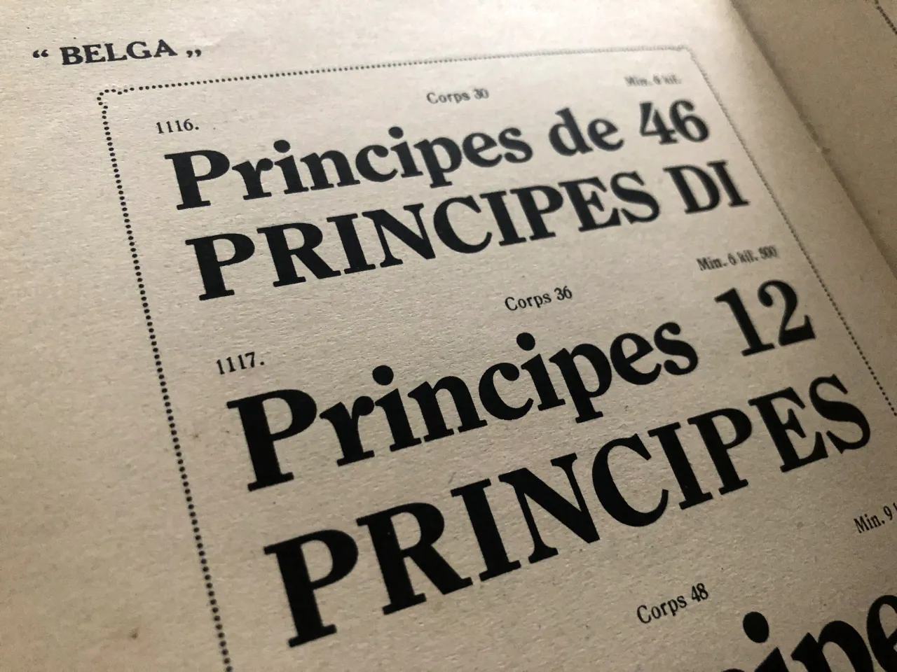
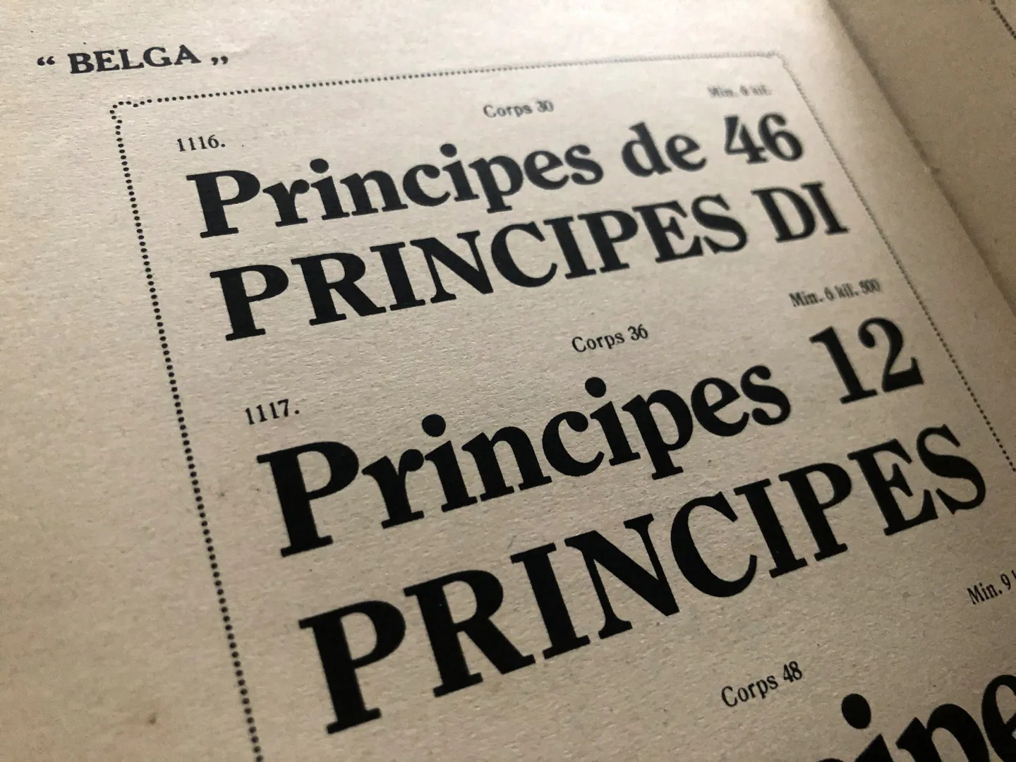
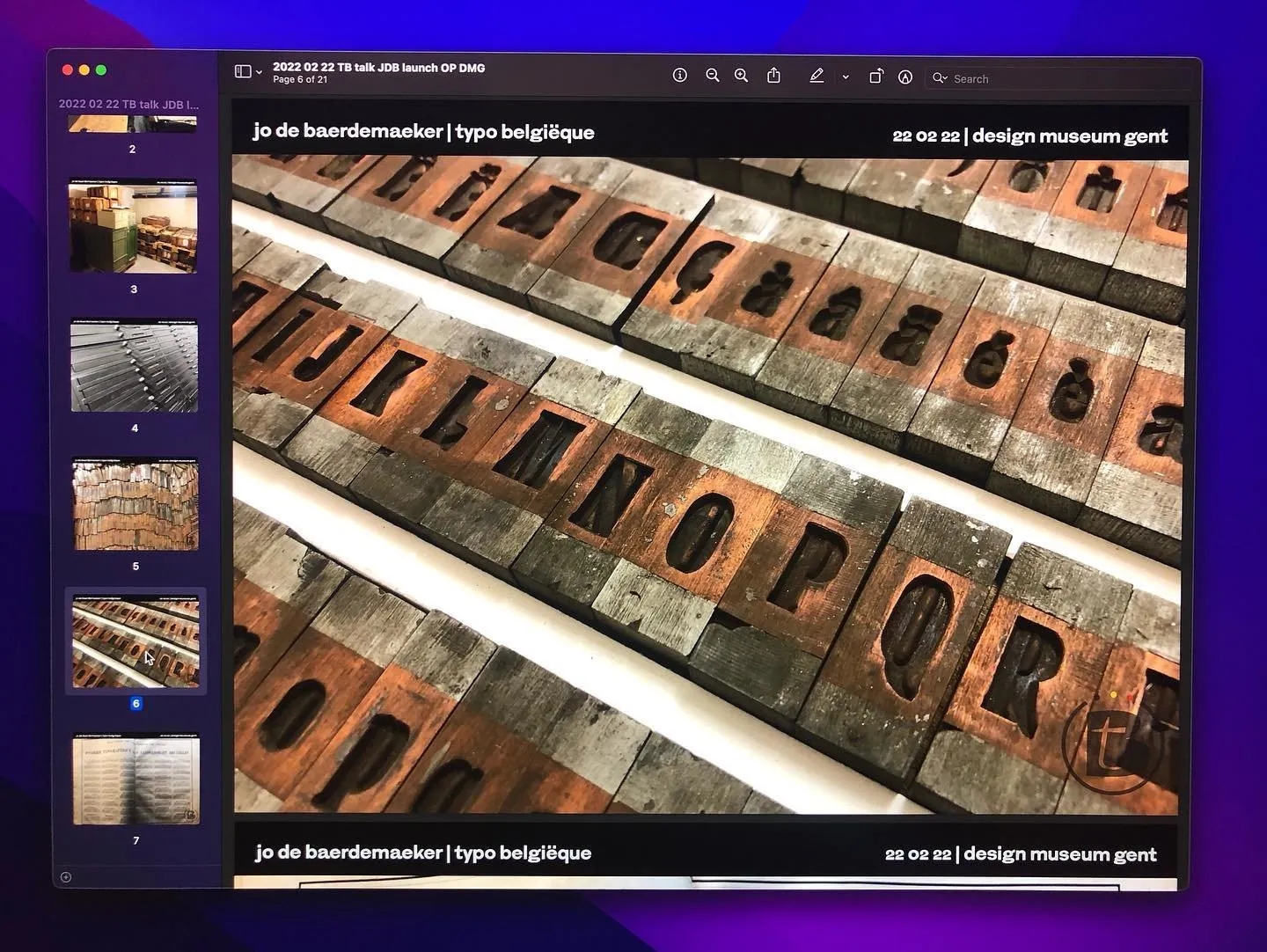
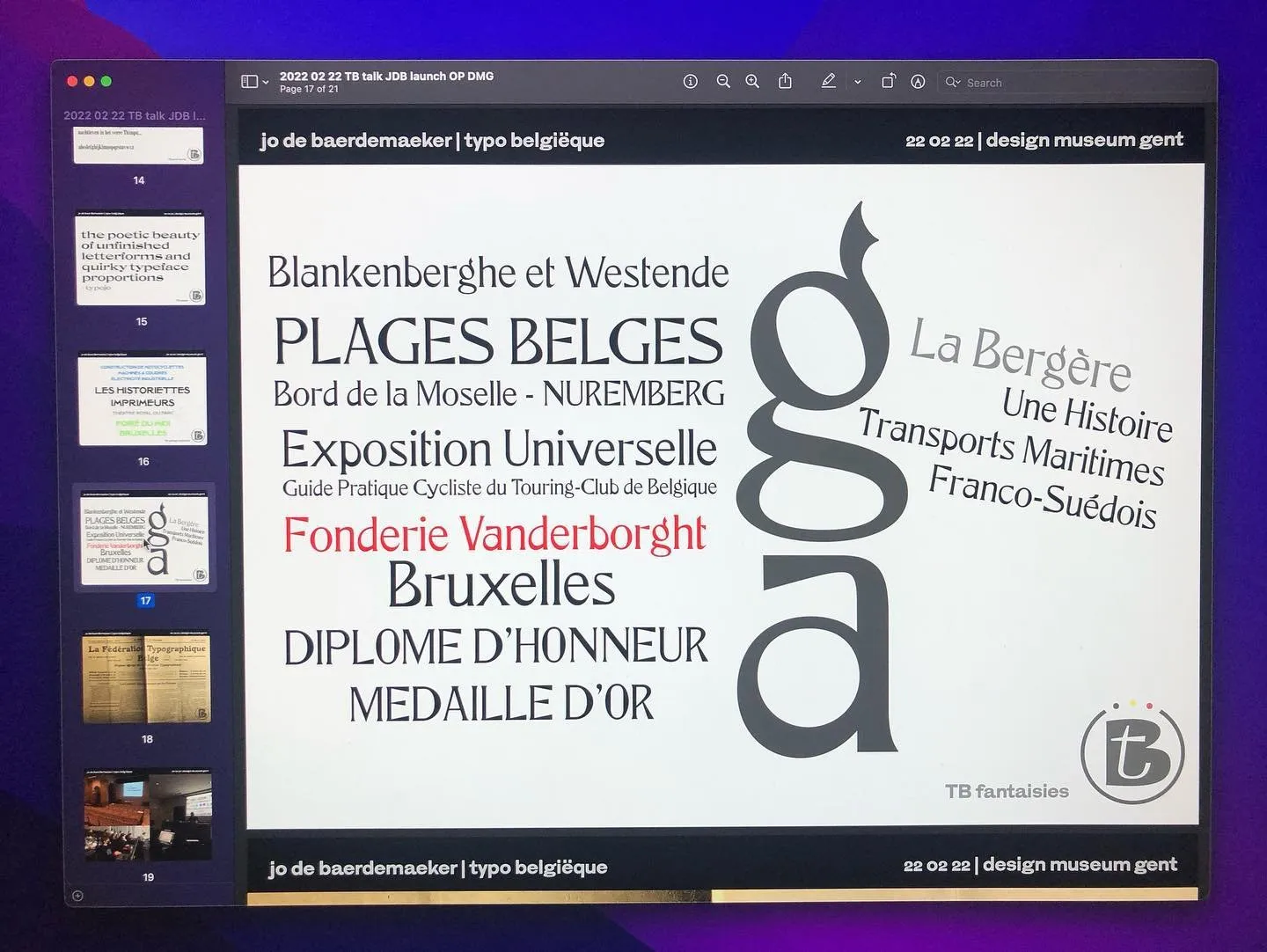
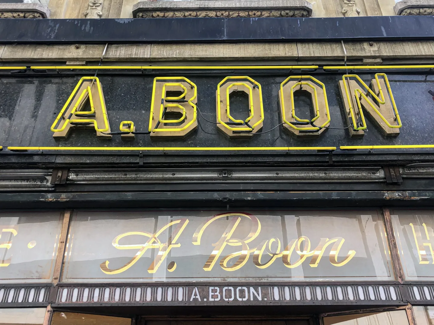
Typo Belgiëque aims to outline the visual design identity of Belgium in the nineteenth and twentieth century, by undertaking a thorough analysis of recently discovered type material of until now unknown Belgian type foundries, and shed a light on this missing link in the typographic history of Belgium, the Low Countries and Europe.
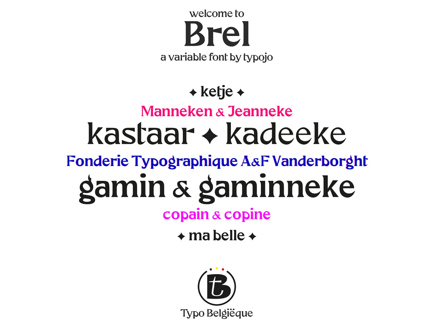
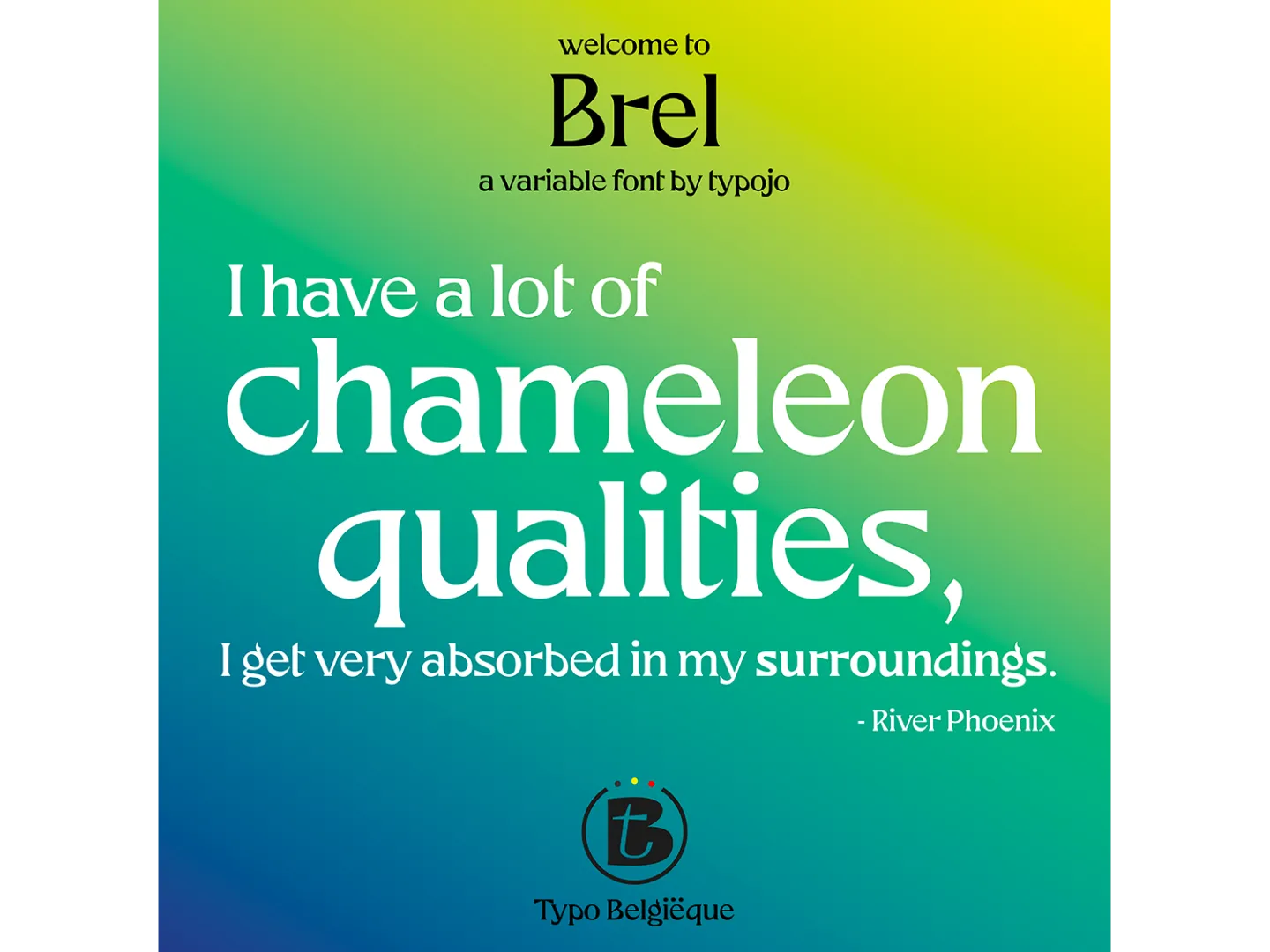
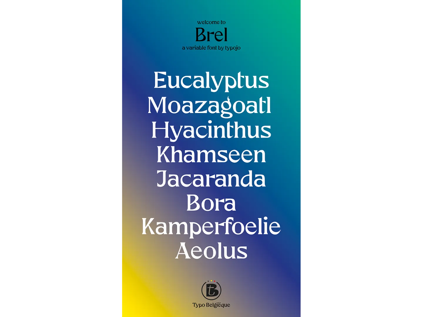
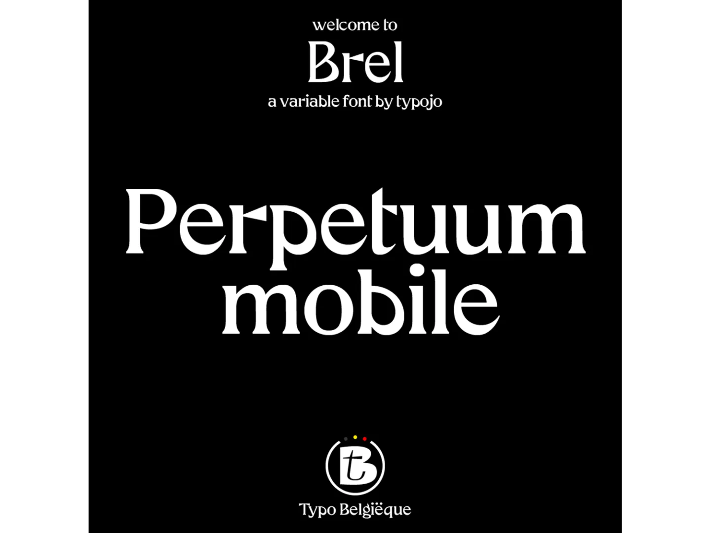
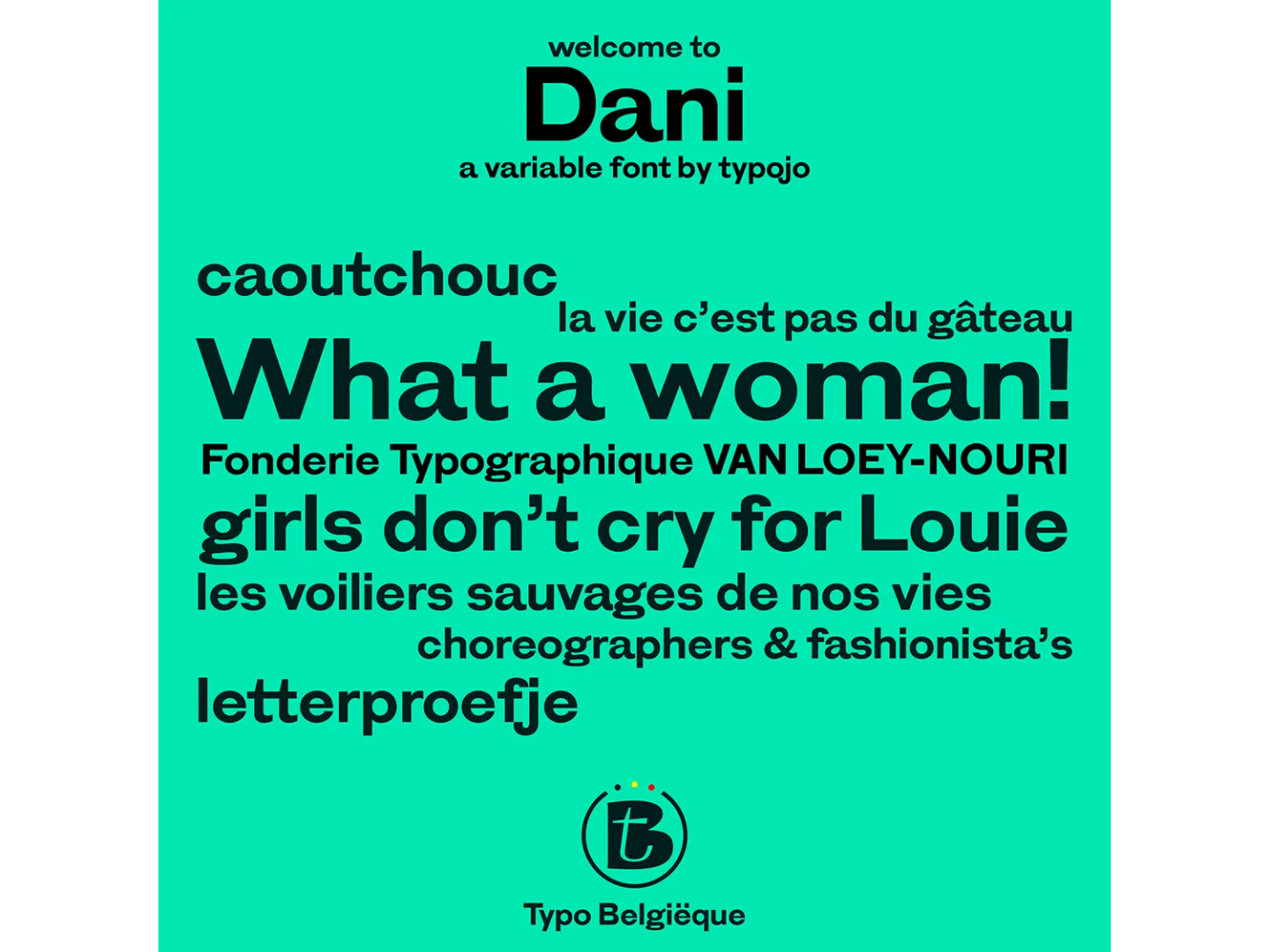
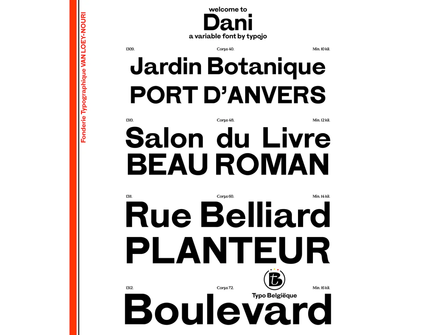
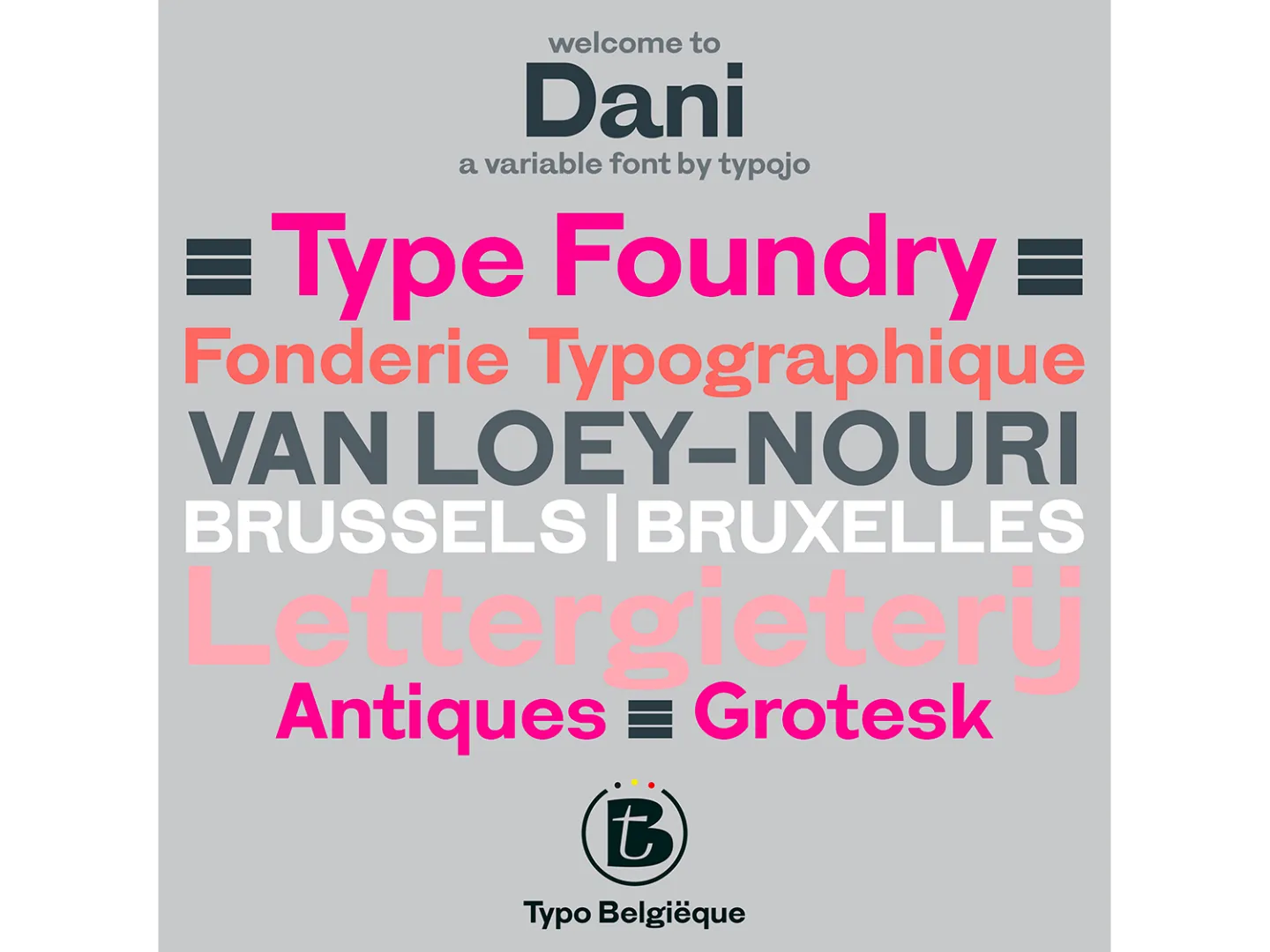
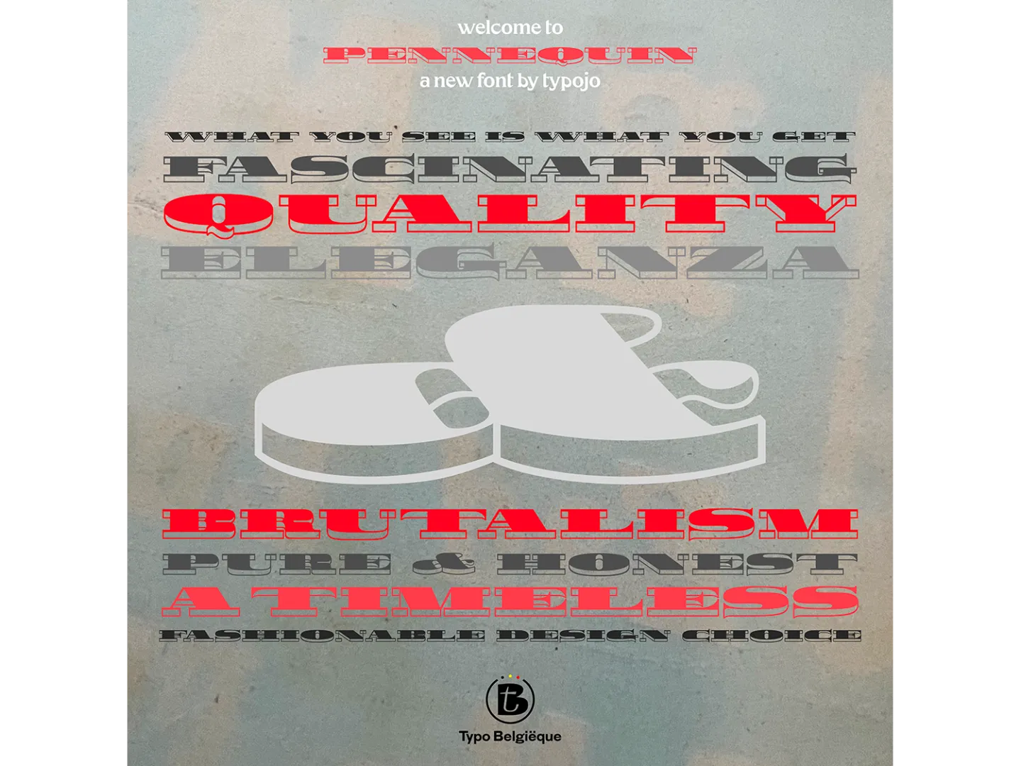
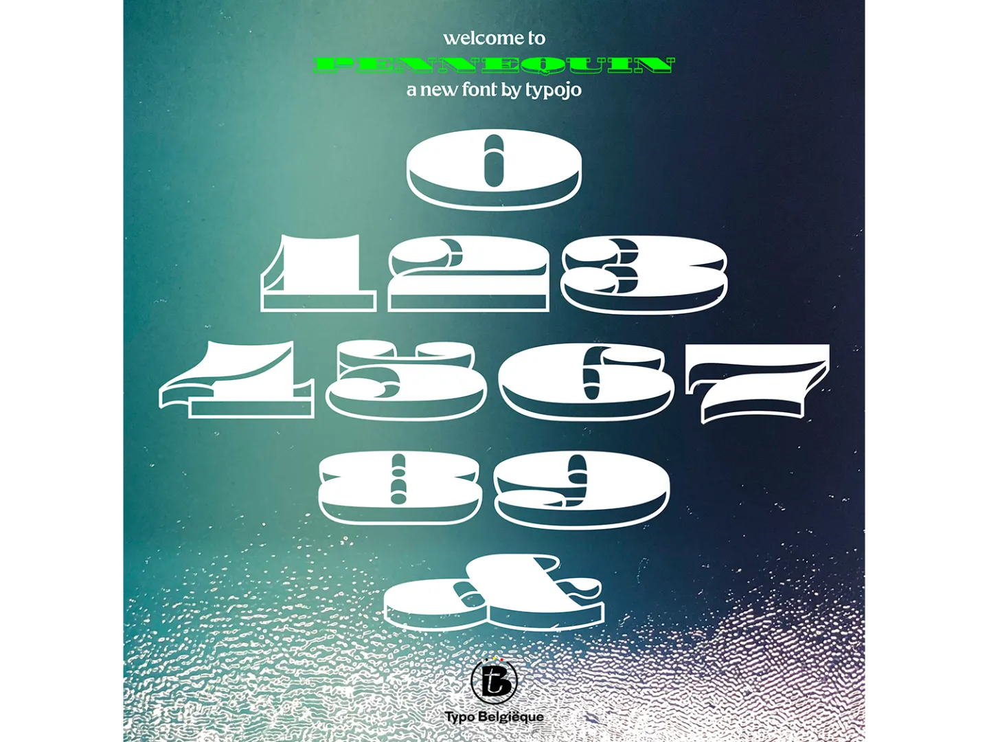
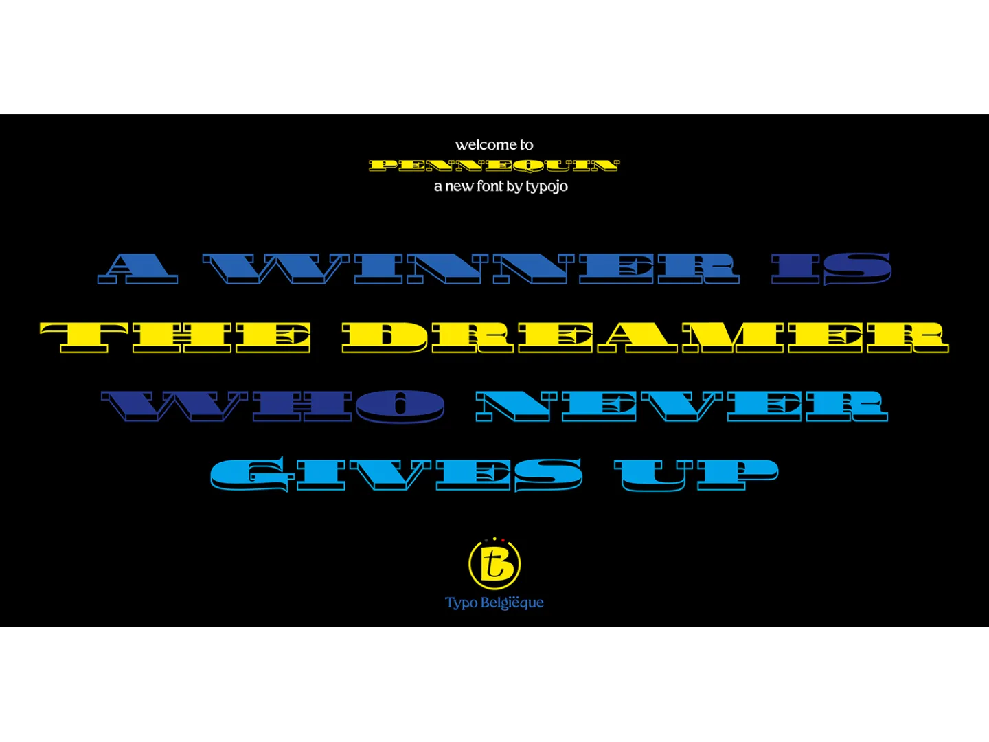
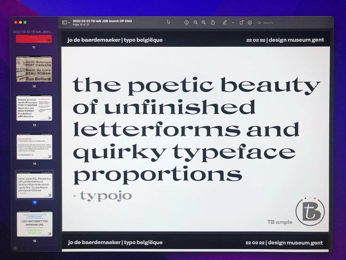
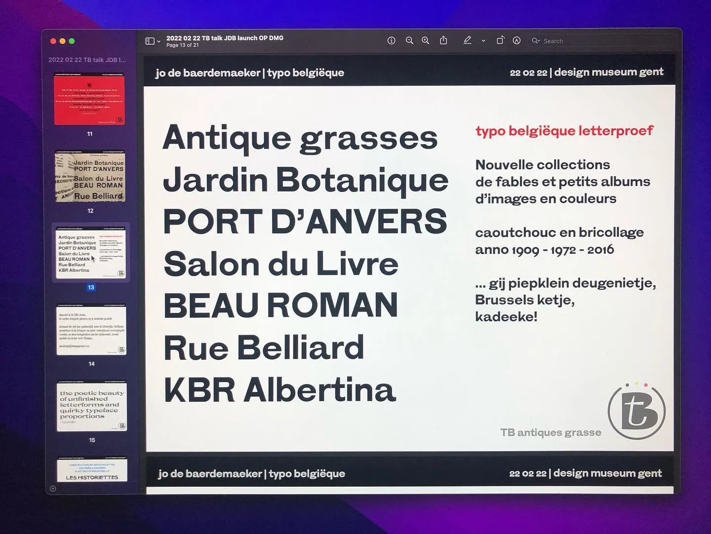
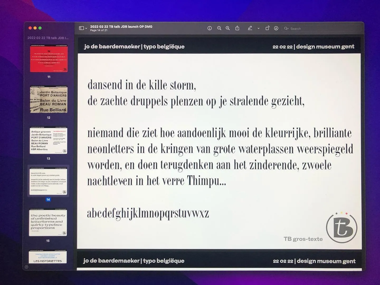
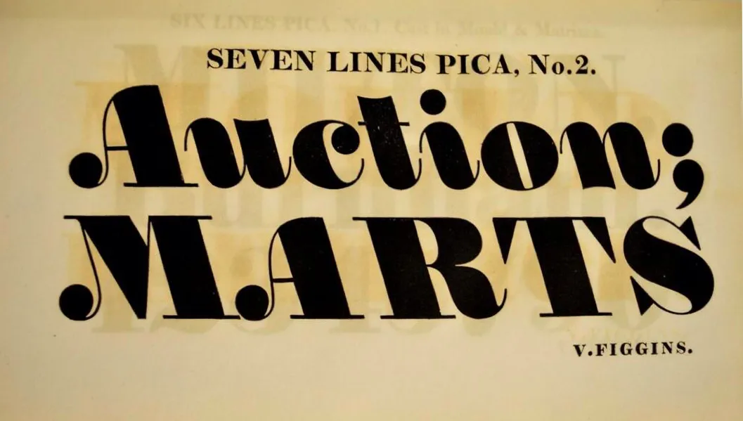
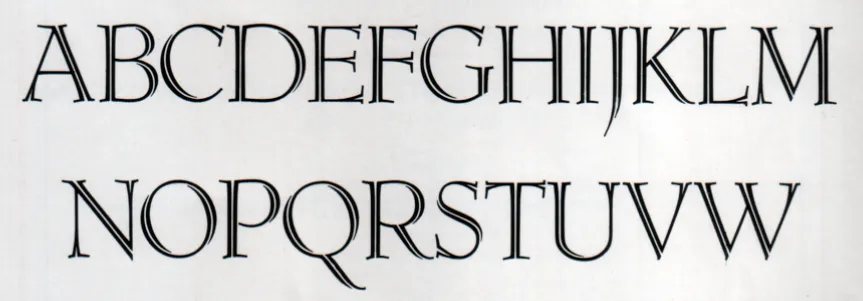
By studying historical Belgian typeface families, and exploring possibilities to reconstruct a Belgian visual identity via digital font technologies, a new collection of digital fonts will be designed and developed as an important practical design output of Typo Belgiëque. A unique selection of authentic printing types will be used as the source of inspiration and the ultimate goal is to reinvigorate these typefaces as digital computer fonts for contemporary use in publishing and media design.
These new and exclusive font families will be developed following the most recent variable font technologies, to secure a high level of legibility and optimal use for dynamic, responsive web- & screen typography in every form of digital publication.
Typo Belgiëque is a two-year practice oriented scientific research project (PWO) at LUCA School of Arts Research unit LABO Pro, which started on February 1st, 2021. More information can be requested via jo.debaerdemaeker@luca-arts.be and www.typobelgieque.be
[update August ’22]:
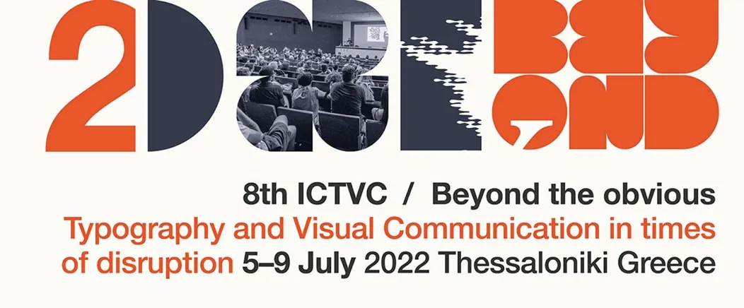
Overwhelmed with all the positive reactions and feedback I received on my Typo Belgiëque presentation at the ICTVC8 Conference in Thessaloniki. Thank you so much #ictvc for the opportunity to share my type design & research project during this amazing & inspiring conference!
Currently preparing my new talk and publication entitled: ‘Forgotten [type] Foundries’
[April ‘23]:
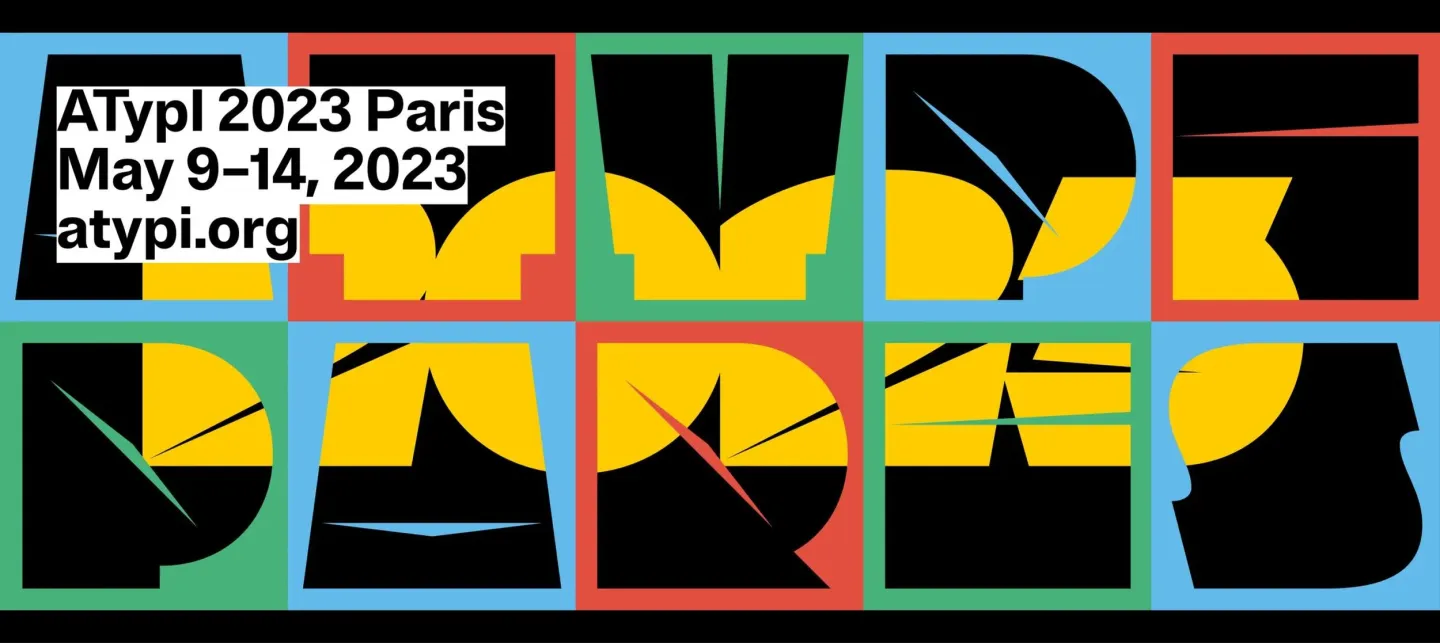
updated presentation and recent developments of Typo Belgiëque will be given at ATypI Paris from 9 to 14 May 2023 + launch of new font families.
[September ’23]:
Delighted to present Typo Belgiëque as a Keynote speaker at the BITS10 Conference in Bangkok on 4 November 2024. Here is a summary of the lecture:
“Type foundries and their branding: the unique impact of branding throughout the history of type design:
In the fast and ever changing environment of visual design, it is key to be creatively original and stand out in the ocean of typographic communication.
In this talk, Jo will take the audience back in time and highlight some case-studies of how historical international type foundries branded themselves through their collections of typefaces and visual imagery of their time. From the start onwards, the type industry has been very competitive, and like today, embracing active trends in art, architecture, music, fashion, lifestyle, entertainment & design, and collaborating with contemporary creative minds and artists was essential in the production of unique typography.
With a special focus on Belgian type foundries of the nineteenth & twentieth century and flash forwards to present-day branding projects that specialise in using type, he aims to illustrate the subtle yet powerful impact of type as a considered visual voice in brand identities.”




































![talk [free]: Tibetan Typeforms – the historical development of Tibetan Typefaces]( https://studiotype.be/media/pages/blog/talk-free-tibetan-typeforms-the-historical-development-of-tibetan-typefaces/eb0e045741-1715264037/tt1jdb-1440x.webp)

![typewalk Antwerp 10 [cancelled due to new covid-19 regulations]]( https://studiotype.be/media/pages/blog/typewalk-antwerp-10-cancelled-due-to-new-covid-19-regulations/10dc578a66-1715264037/date-type-walk-021-1440x.webp)