About ST Wiels
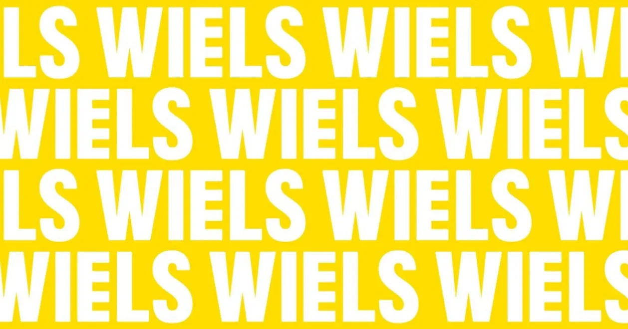
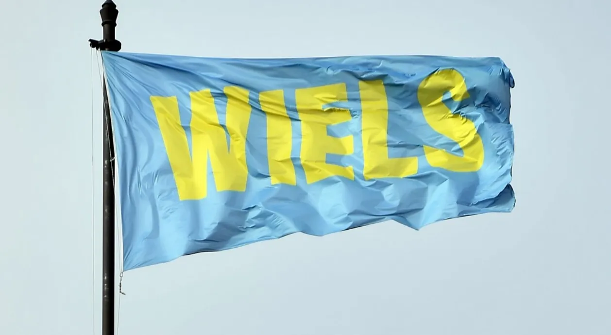
Wiels Bold was designed for WIELS, Centre of Contemporary Art in Brussels, Belgium.
Sara De Bondt, who was in charge of the visual identity of this art centre, asked me to create a display font to be primarily used for headlines, posters & signage, and on their website.
Our collaboration resulted in a pleasing yet strong sans serif face in three weights, inspired by the architecture of the iconic WIELS-building (also called Blomme Building or Wielemans-tower), which was erected in 1930 by architect Adrien Blomme as the brewery house of the Wielemans Brewery. The iconic bold 4-tier structure of the building is one of the rare still-standing examples of modernist industrial architecture in Brussels, and was the inspiration behind the WIELS-logo and its ‘E’ with the extra bar.
The further development of the sans-serif Wiels font family also references design elements of the typography used in Marcel Broodthaers’ plaque for his ‘Musée d’Art Moderne, Dt. Des Aigles’, as well as other of his remarkable artworks.
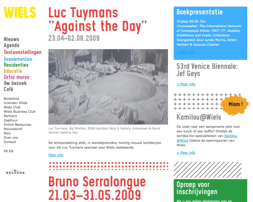
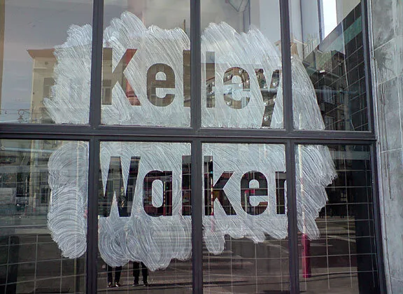
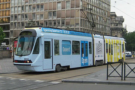
Font in use