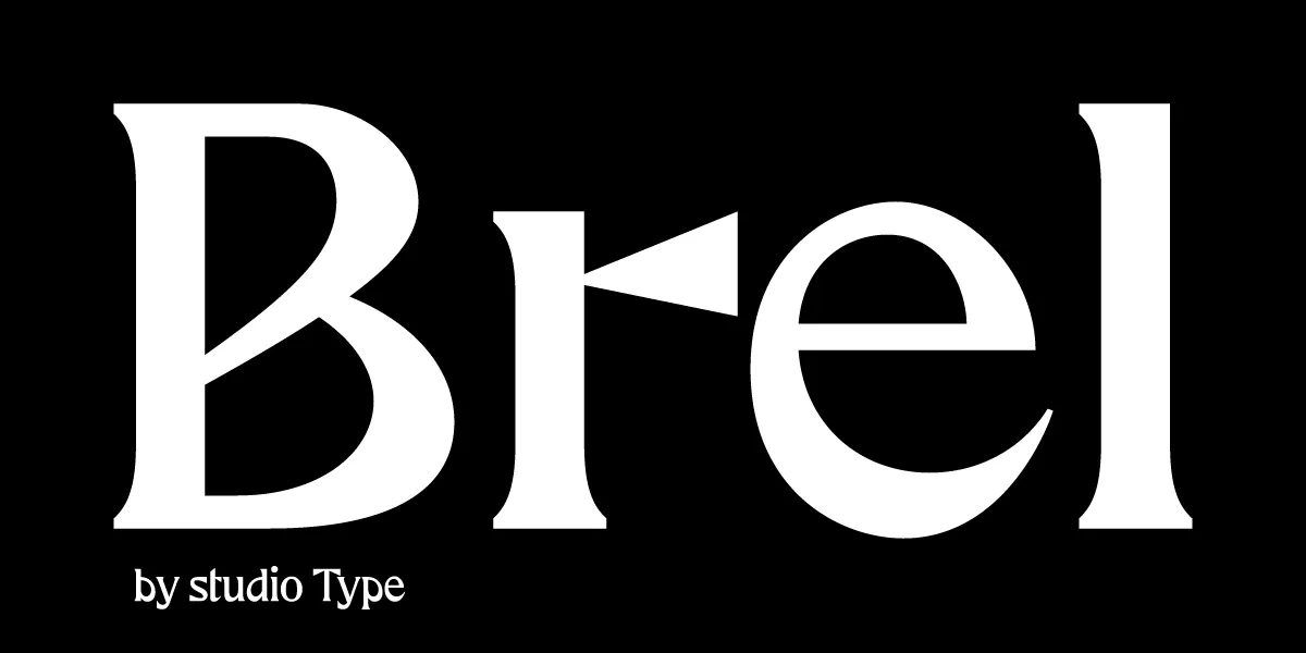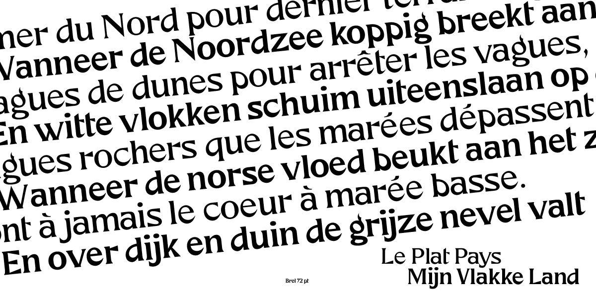

Brel is a unique and quirky new serif typeface with Belgian roots, is the first official release by this recently established Belgian font foundry studio Type.
Brel is part of ‘Typo Belgiëque’, a practice oriented scientific research & type design project examining the visual design identity of Belgium in the nineteenth and twentieth century that breathes new life into Belgium’s historical typeface families.
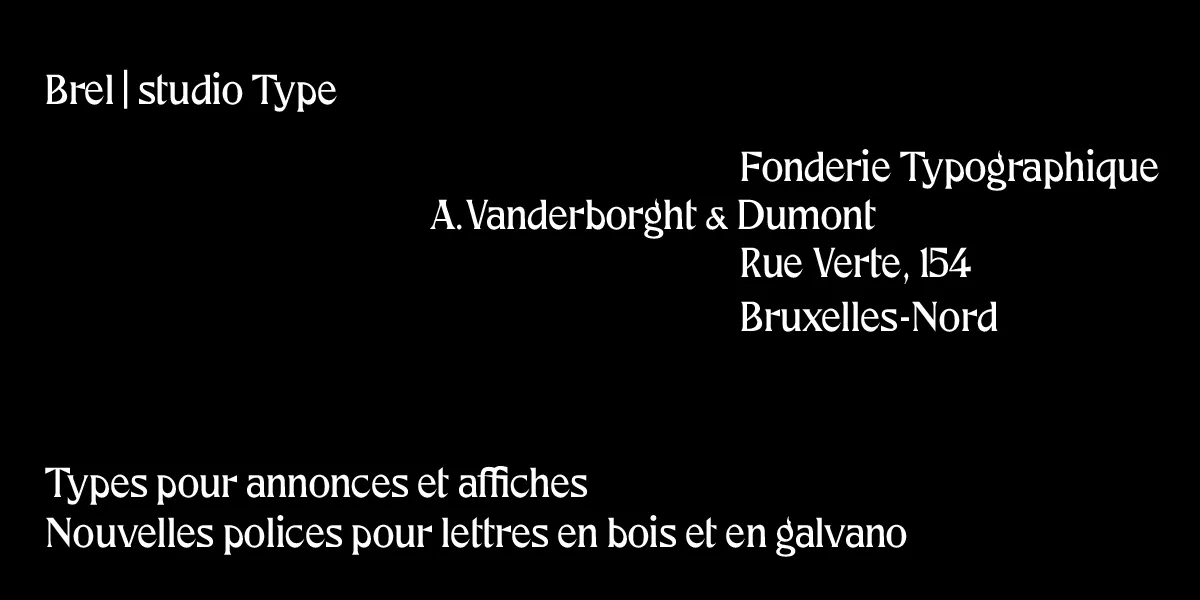
Brel is a respectful contemporary interpretation of an extraordinary metal display typeface that originates from the type collection of Fonderie Typographique A. Vanderborght & Dumont, a 19th century Belgian type foundry in Brussels. This new and exclusive font not only reinvigorates this historic typeface. Brel was developed following the most recent variable font technologies, to guarantee a high level of legibility and optimal use for dynamic, responsive web & screen typography for contemporary use in every form of digital publishing and media design.
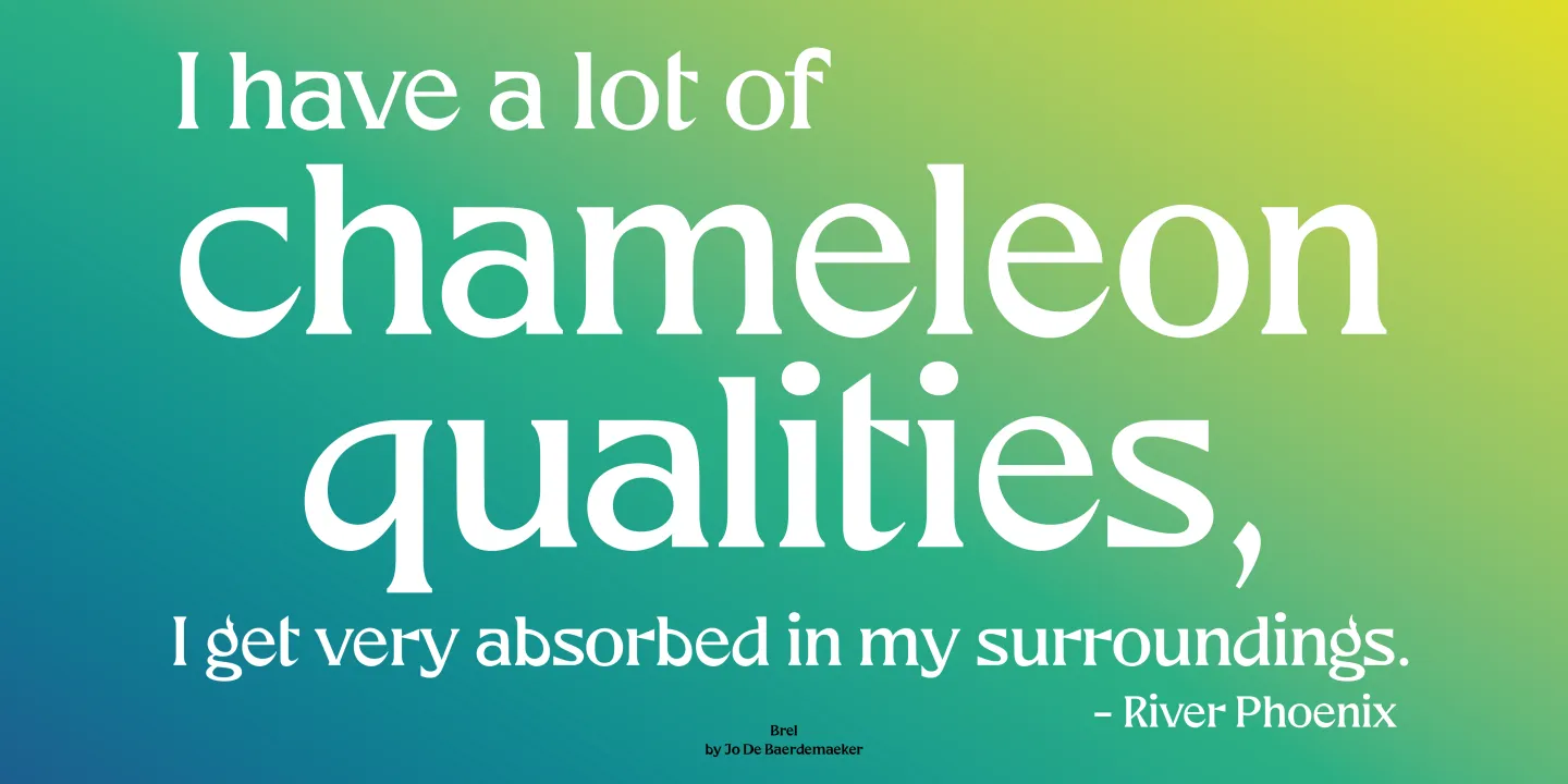
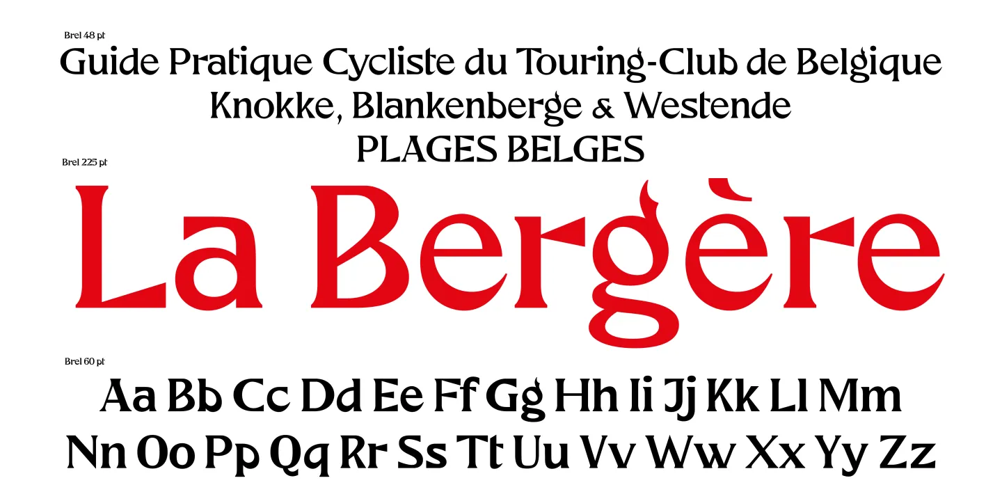
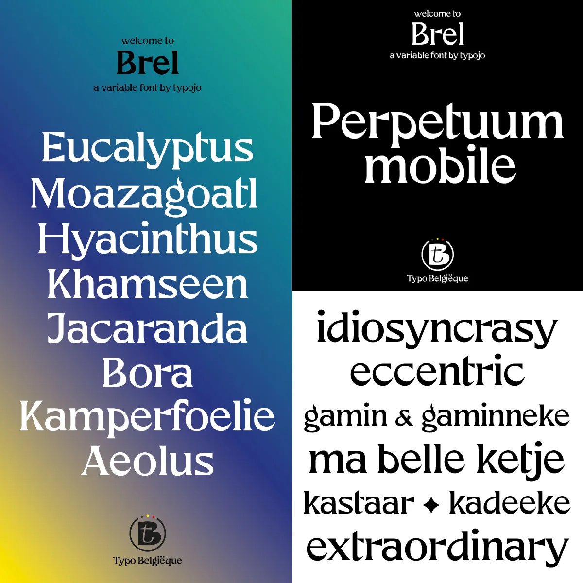
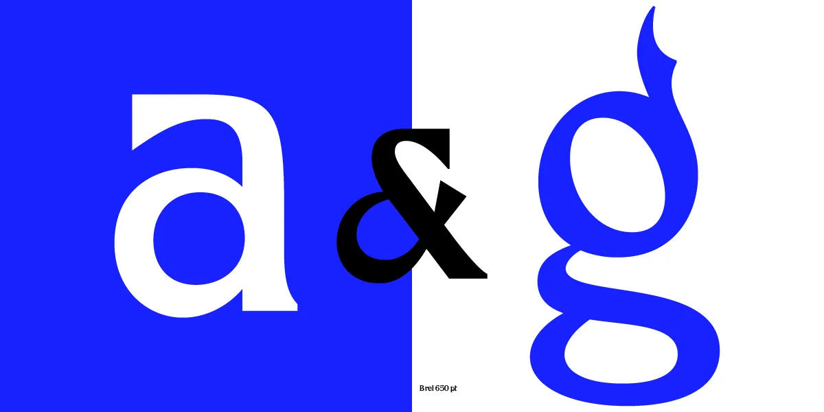
The atypical, but original, design interpretation of lowercases ‘a’ and ‘g’ as main features make Brel stand out from other seriffed font families. Crafted with a careful eye for detail, this extraordinary joyful typeface is suitable for editorial publications, visual identities, advertising or packaging design. Although Brel would initially function best as a display font, it also works surprisingly well in body texts. Brel hopes to become an invaluable, eccentric addition to the font libraries of many a designer. ◊
Font in use
