About
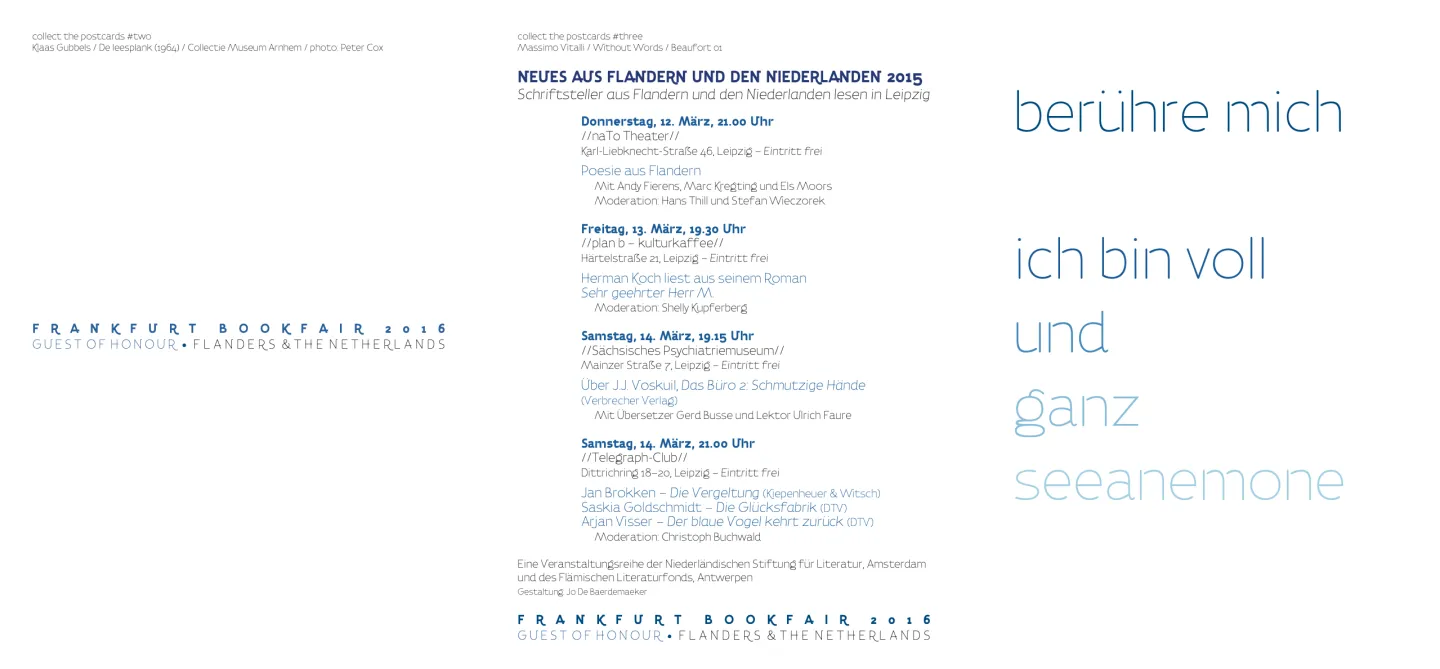
Tenzin is a thin, light-weighted sans serif font that found its origin as the typeface for the visual identity of Flanders and The Netherlands joint guests of honour presentation at the Frankfurt Book Fair (Frankfurter Buchmesse) in 2016.
“From the start, artistic director Bart Moeyaert emphasized a need to organize the branding of the project around three themes shared between Flanders and the Netherlands (and Germany): a common history, shared dynamism, and the North Sea.
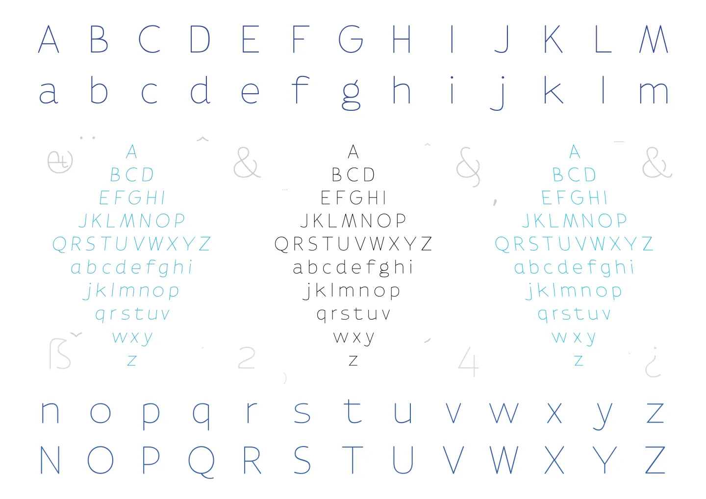
As it turns out, creative nods to the partnership between Flanders and the Netherlands are omnipresent in the project’s branding. Take the colour scheme: the blues in the logo, which, Moeyaert (2015) explains, represent the blues of the Westerschelde, the mouth of the River Scheldt, where the two territories of the Netherlands and Flanders flow together. Complementing the blues is a yellow/grey, the colour of North Sea beach sand. The notion of fluidity between the two partners is further activated in a typeface designed by Jo De Baerdemaeker especially for the fair, whose letter structure is inspired by the famous typographical collections of Plantin-Moretus of Antwerp, Johannes Enschedé & Zonen of Haarlem, and Lettergieterij Amsterdam. A large collection of ligatures has been added so that each letter runs into the next, illustrating again the ‘dynamic flow’ between the Netherlands and Flanders.” – from “This Is What We Share. Co-branding Dutch Literature at the 2016 Frankfurt Book Fair” by Jack McMartin
Tenzin is part of a unique type system with 6 different weights that De Baerdemaeker conceptualized, which includes italic and reverse italic styles to represent the tides and other natural elements of the North Sea. The design of the letterforms is inspired on the analysis of representative printing types of the type tradition in Flanders and The Netherlands. Jo also decided to implement the features of a typewriter typeface, to add a respectful wink to the Flemish and Dutch authors of past years. The font family was used throughout all the communication and branding publications of the Frankfurter Book Fair .
Tenzin is currently being expanded with glyphs for the Tibetan writing system. ◊
Font in use