Lean Back: the evolution of reverse italics
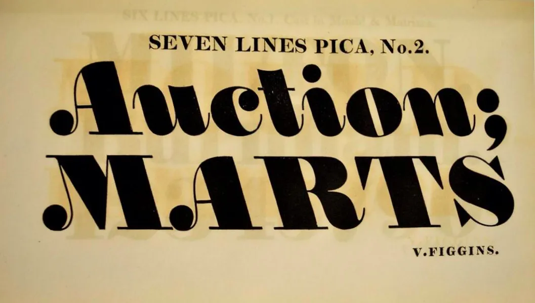
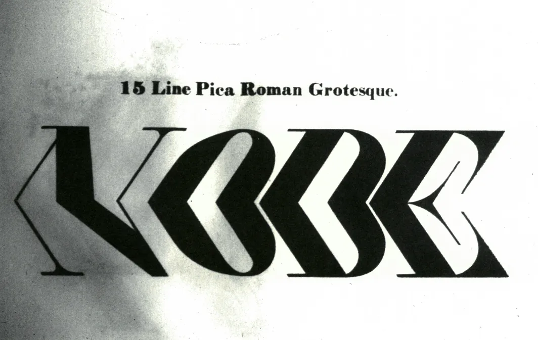
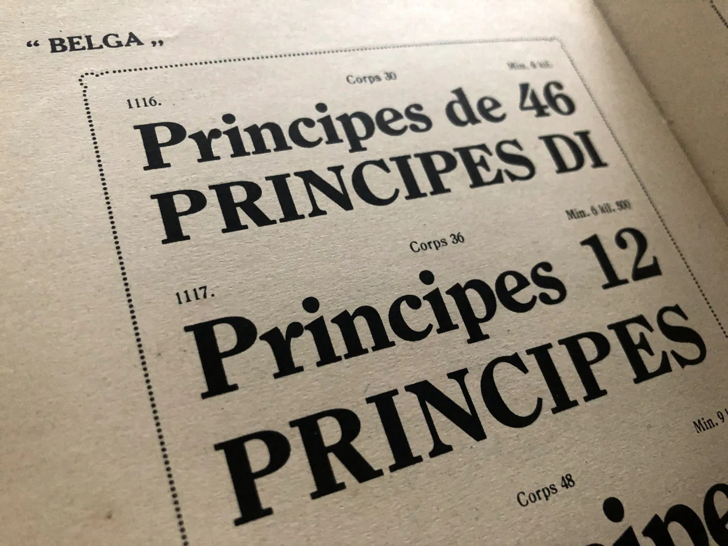
Seven Lines Pica No 2 is, arguably, the first time a reverse italic style of printing was introduced for typographic use. This printing type differs in style from other conventional italic weights for the reason that its italic angle does not lean towards the right (or forward), as was the normal way of cutting the characters, since the type had to reflect the cursive way of handwriting. On the contrary, in his ‘Specimen of printing types’(1815), Vincent Figgins (1766–1844) decided to offer an large size italic display type, leaning towards the left.
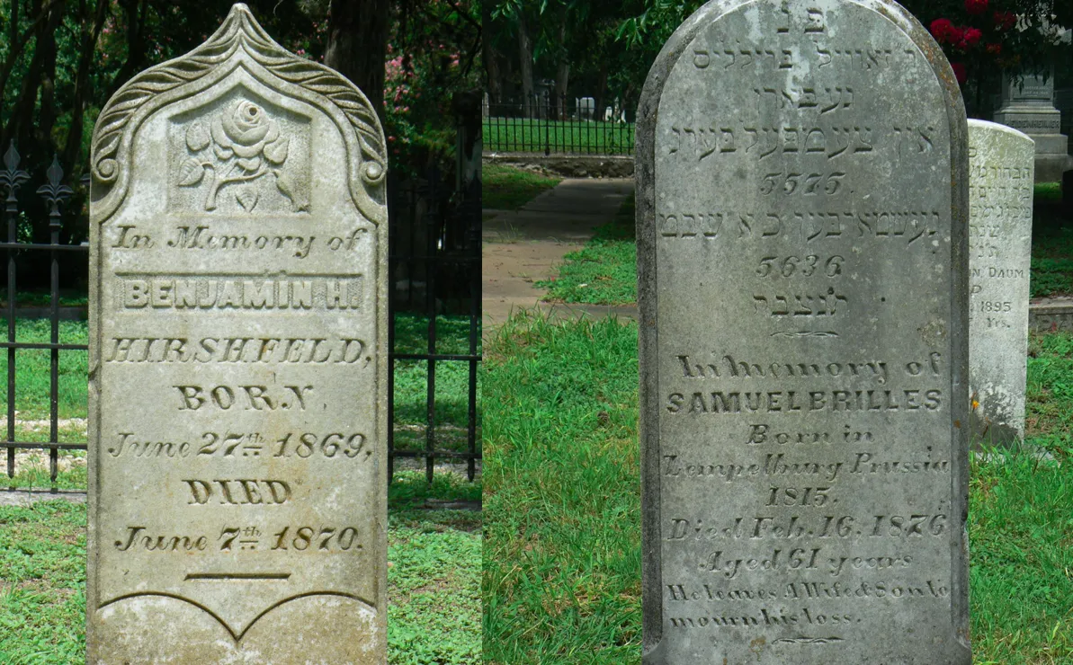
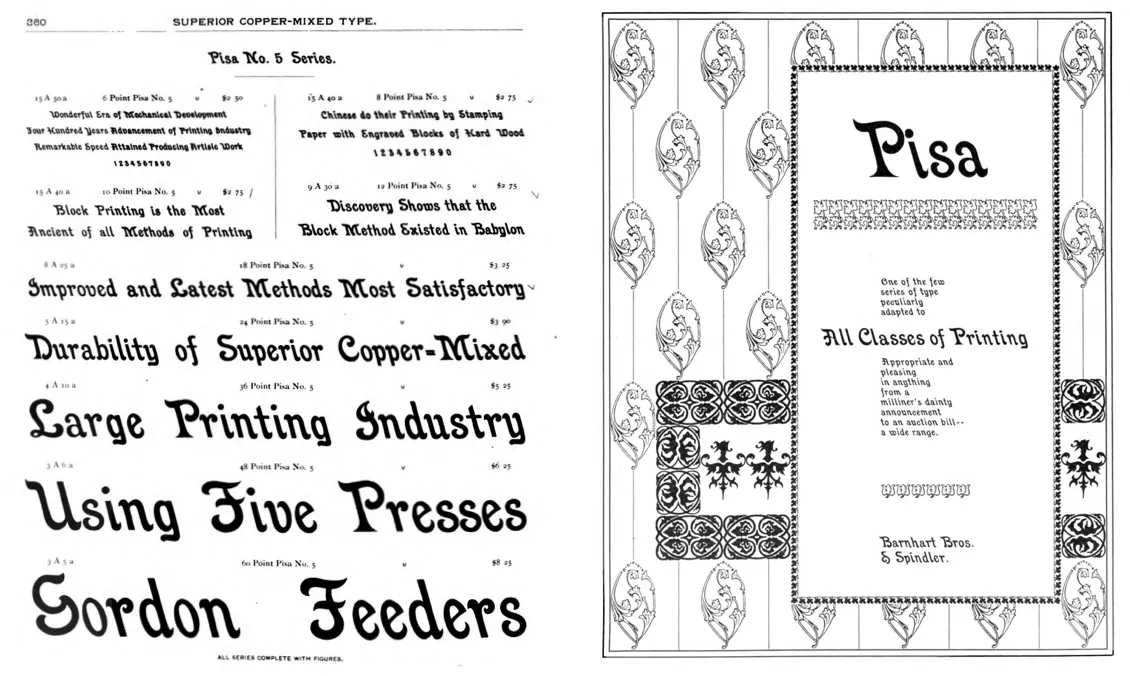
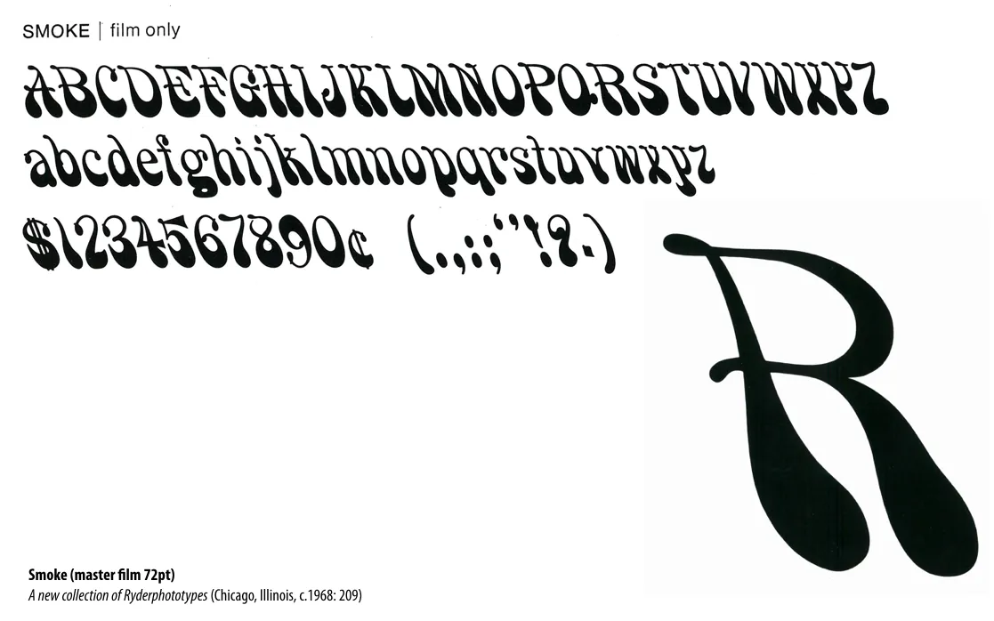
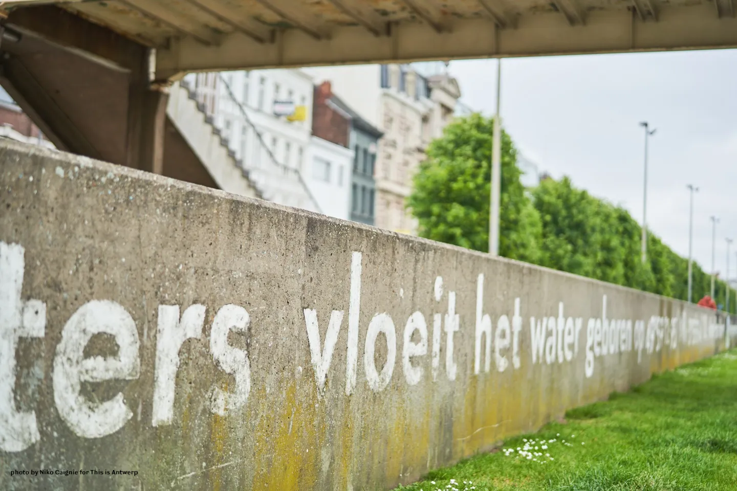
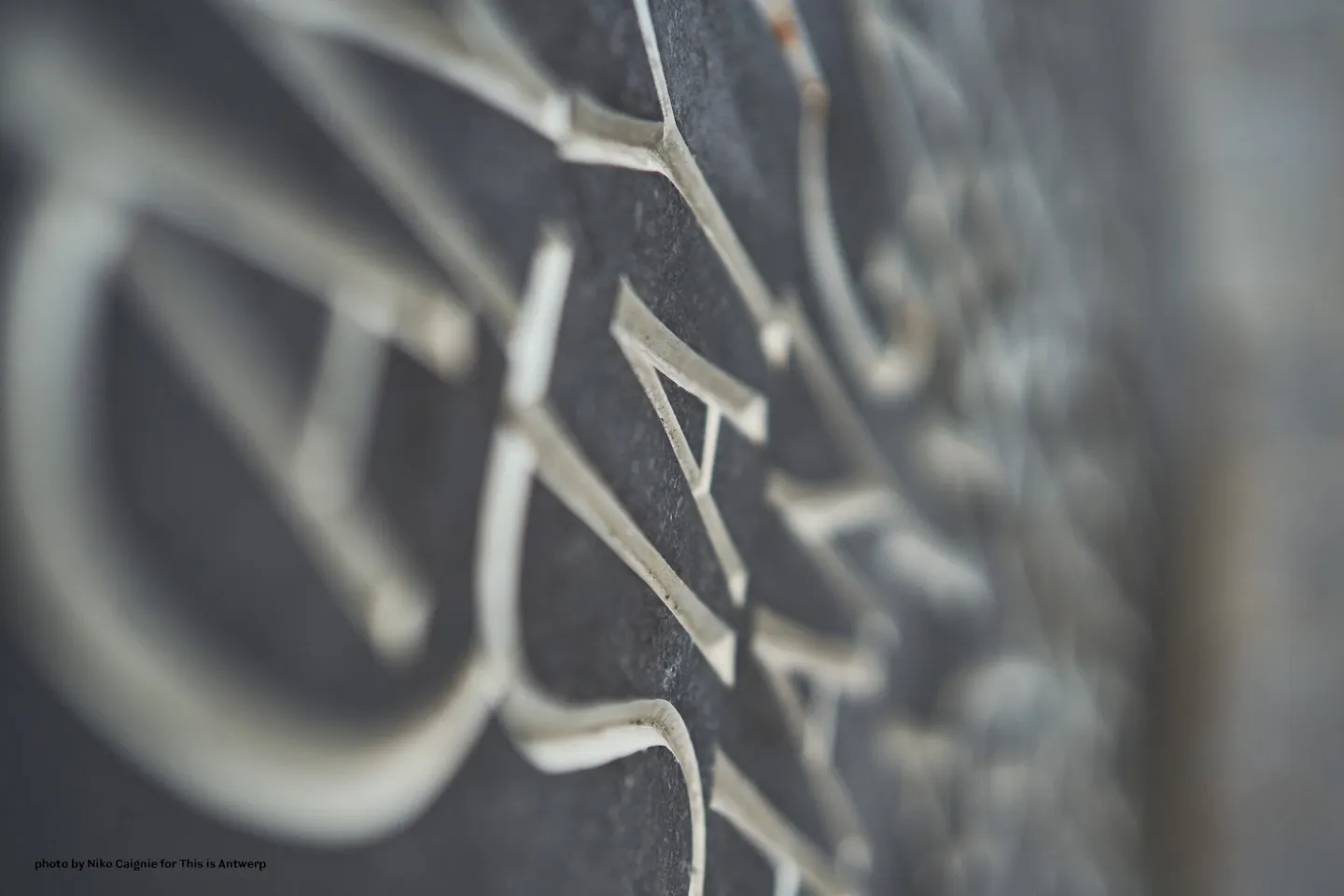
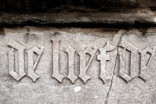
In this research project, De Baerdemaeker investigates the origin and evolution of reverse italic typefaces, and the typographic practice of this specific typestyle in different typesetting systems. In addition to exploring writing practices in a reverse italic hand, which were used in cartographic design and stone carving, he also compares the characteristics of various reverse italic typefaces, and their creators. In addition, the study also highlights contemporary practices of digital reverse italic fonts.
De Baerdemaeker proposes that typeface designers could include this reverse italic typestyle as an extra weight (or axis) in their (variable) font families, in order to allow for an ever more expanded typographic freedom in print and on screen.































![talk [free]: Tibetan Typeforms – the historical development of Tibetan Typefaces]( https://studiotype.be/media/pages/blog/talk-free-tibetan-typeforms-the-historical-development-of-tibetan-typefaces/eb0e045741-1715264037/tt1jdb-1440x.webp)

![typewalk Antwerp 10 [cancelled due to new covid-19 regulations]]( https://studiotype.be/media/pages/blog/typewalk-antwerp-10-cancelled-due-to-new-covid-19-regulations/10dc578a66-1715264037/date-type-walk-021-1440x.webp)